You have 3 free guides left 😟
Unlock your guides3.3 Long-Run Production Costs
3 min read•june 18, 2024
Jeanne Stansak
dylan_black_2025
Jeanne Stansak
dylan_black_2025
Introduction
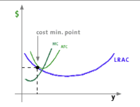
In the previous unit, we discussed what costs look like in the short run by examining , , , and . This unit examines costs in the , when all are variable. When factors of production are all variable, we can more effectively minimize costs since we're no longer forced onto one average total cost curve, but can rather minimize costs along any quantity of labor and capital. We'll expand on these long-run costs to explain .
Resources in the Long-Run
In the long-run, all resources are flexible, so firms can change both their plant capacity and output level. This allows firms to analyze and compare the average total cost of production at each plant capacity in the short-run, and find the that allows them to product output at the lowest possible ATC.
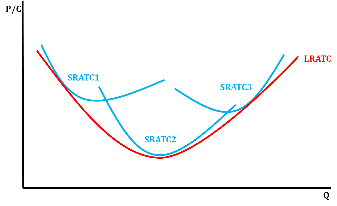
In the graph below, the blue curves show several different plant capacities for a particular firm. SRATC1 is when production is beginning and the firm is not using its entire plant capacity. The low production hinders , causing the ATC to be very high. For example, a car company that makes only 50 cars will have a very high cost per car.
As the firm continues production, its growing capacity enables mass production and to take place, which leads to the point where ATC is at its lowest. A car company that produces 100,000 cars will have a very low average cost per car (SRATC2). As the firm expands and its output becomes larger than its plant capacity, it becomes too big to manage. Its costs per unit begin to rise again. This is the point where there is too much input needed, sr-costs rise (SRATC3).
The LRATC curve is found by taking the lowest average total cost curve at each level of output. These are the ATCs that are tangent at that Q, hence why they seem to straddle the LRATC curve.
The graph below helps us understand where that SRATC comes from:
When we have many SRATC curves, we see the LRATC:
Economies of Scale
The U-shape of the long-run ATC (LRATC) curve is a result of economies of scale and that is experienced by the firm.
- Economies of scale refers to the reduction in total cost-per-unit as a firm increases its production. In this phase, the firm can reduce its total cost-per-unit by boosting its plant capacity and output.
- Diseconomies of scale refers to the rise in total cost-per-unit as the firm increases its production. In this phase, the firm would be better off reducing its plant capacity and output in order to lower their per-unit costs.
- In between these two phases is what we refer to as . When the firm increases production, costs stay the same. The ATC is at its lowest here.
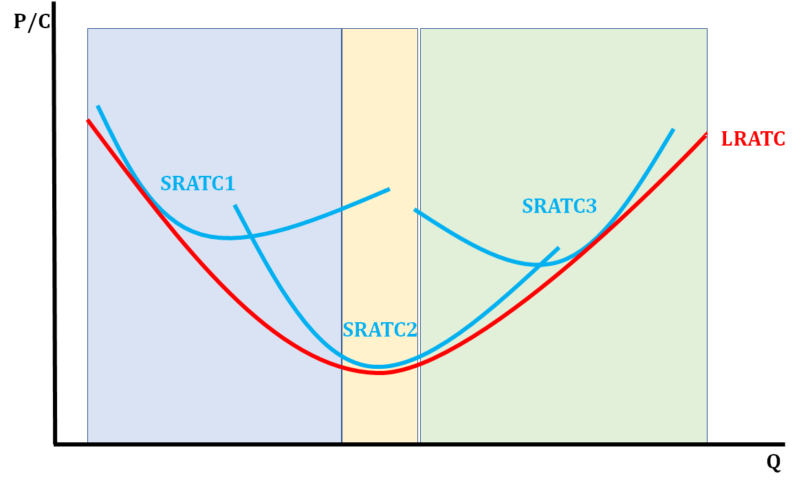
The light blue area represents economies of scale because as output is increasing, costs are decreasing. The light yellow area represents a constant return to scales because as output continues to increase, costs remain constant. The light green area represents diseconomies of scale because as output increases, costs rise.